Cut Spike Distillery
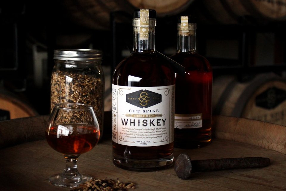
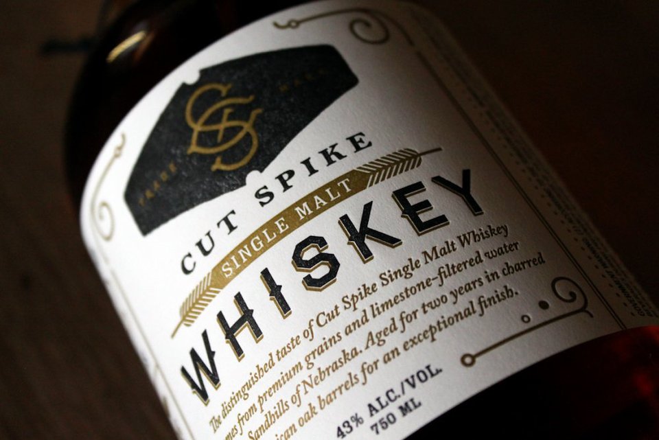
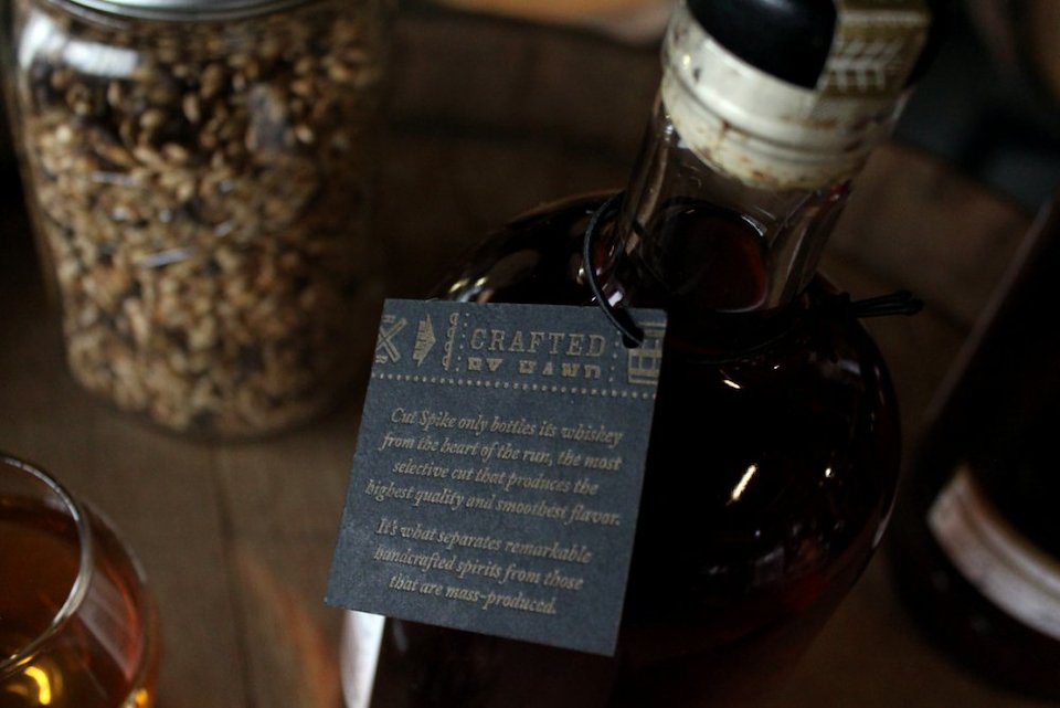
A new, Omaha-based distillery wanted a brand that captured the essence of its dedication to craftsmanship and Midwestern roots. The name—taken from a term for a handmade rail spike—perfectly fits these handcrafted spirits from a historically railroad town. Textural elements and letter-pressed labels further push the notion of painstaking labor done by hand. This won Print magazine’s Best of the Region – Midwest.
Name & Branding

Logo Mark
Packaging
Packaging
Packaging
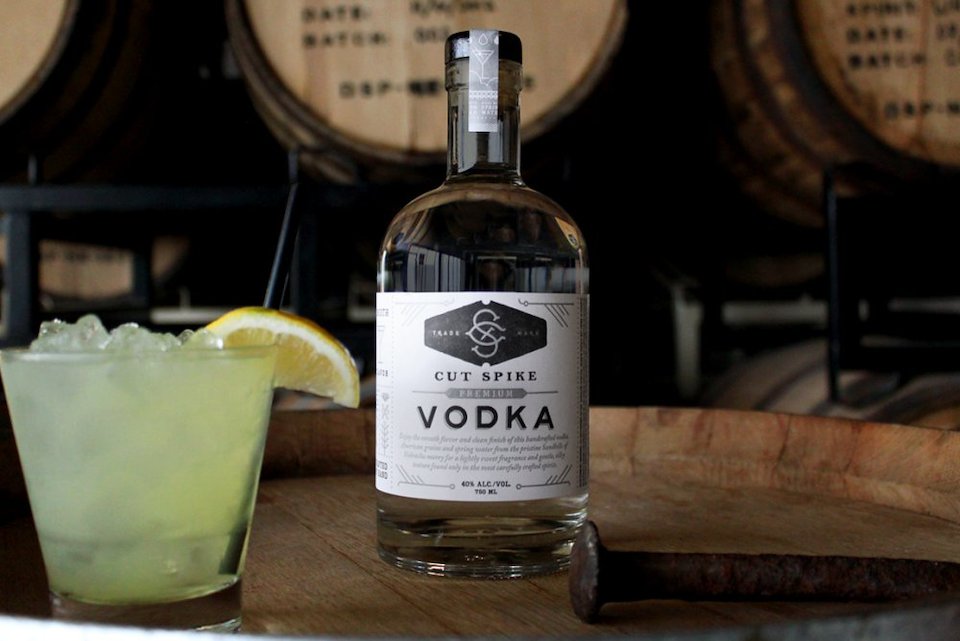
Packaging
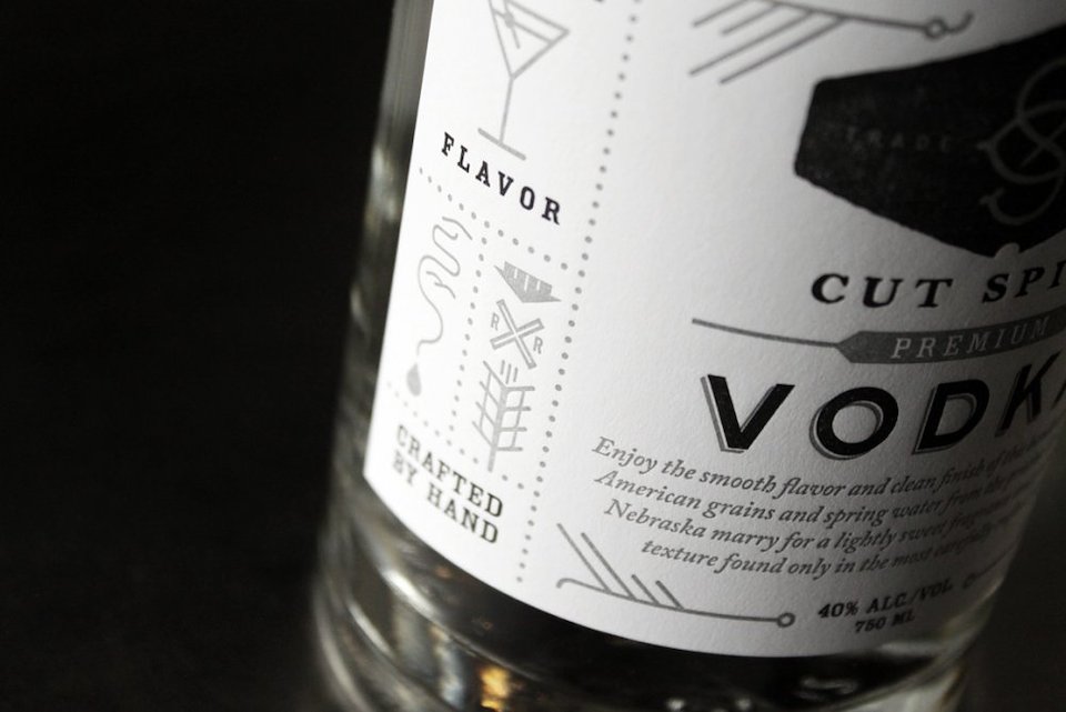
Packaging
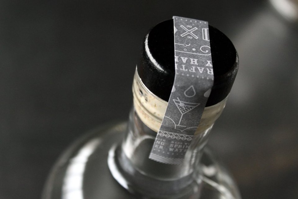
Packaging
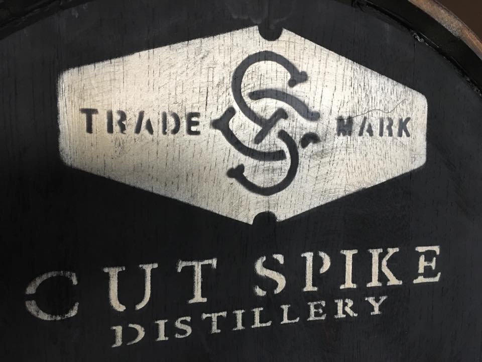
Environmental Visual